Viva Finance — UI/UX design
- Type of work
- UI/UX DESIGN
- Client
- DIGITAL FINANCE INTERNATIONAL
- Date
- 2025- 2026
- Credit
- ANDREY IMAEV (HEAD OF MARKETING)
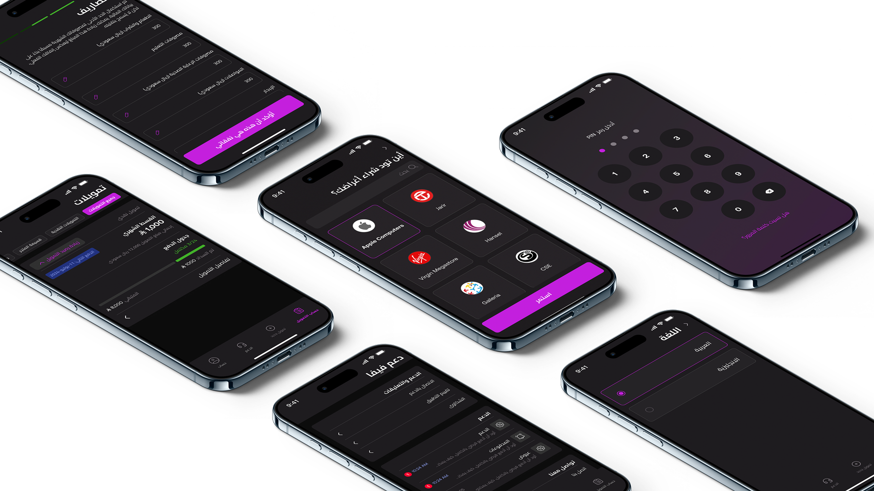
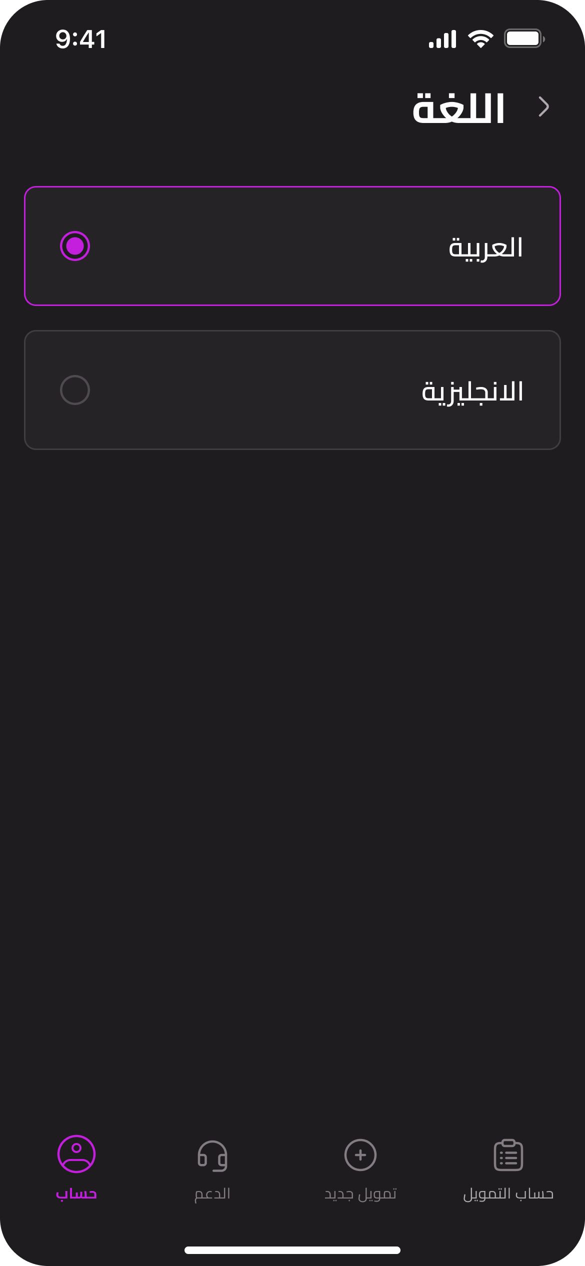
Viva Finance is a Shariah-compliant loan-tech platform built for the Saudi market, offering personal financing and store vouchers with flexible installment repayment. The experience was designed across mobile and web, supporting both Arabic and English, as well as light and dark themes.
01 — Context
Viva Finance was being developed as a new digital financing experience for the Saudi market. The product needed to balance a straightforward personal finance experience with the requirements of Saudi financial services, including local verification processes such as SIMAH, while remaining aligned with the principles of Shariah-compliant financing.
02 — Challenge
The challenge was to turn a complex financing process into an experience that felt clear and approachable. The product had to work across mobile and web, accommodate Arabic and English, support RTL and LTR layouts, and maintain consistency between light and dark themes. At the same time, the underlying flows needed to account for financial checks, eligibility, repayment and other requirements specific to the Saudi market.
03 — My role
As the key designer on the project, I was responsible for shaping the product experience from the initial low-fidelity wireframes through to the final high-fidelity prototype.
- Designed core user journeys across the native mobile app and web
- Built the design system from the existing brand guidelines
- Designed for Arabic / English and RTL / LTR
- Worked across light and dark modes
- Collaborated with stakeholders throughout the design process
- Conducted user testing and A/B testing to validate key experiences
- Created the visual assets, interactions and supporting UI needed across the product
04 — User journeys
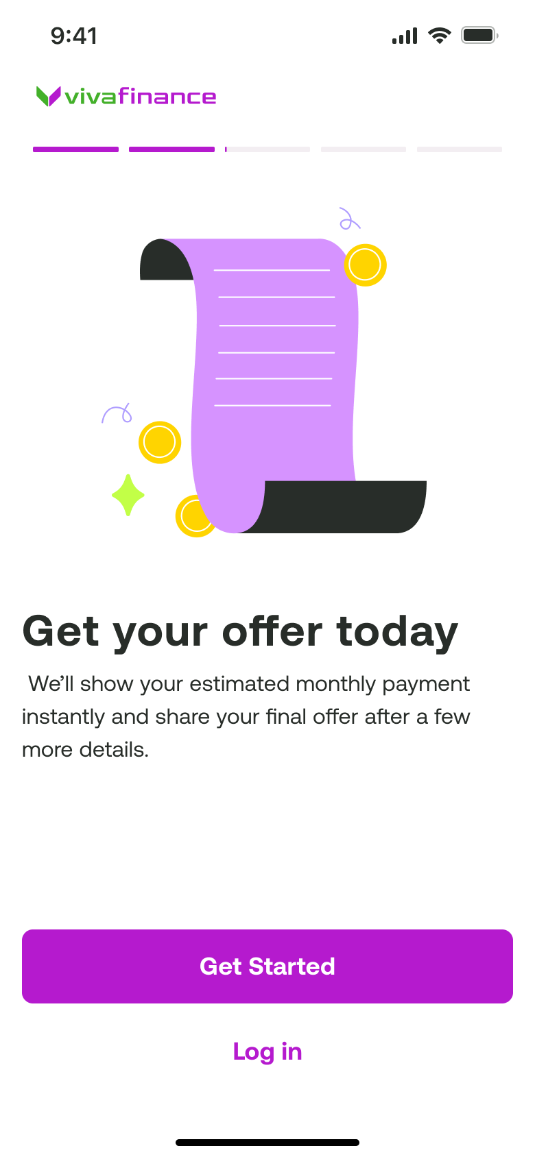
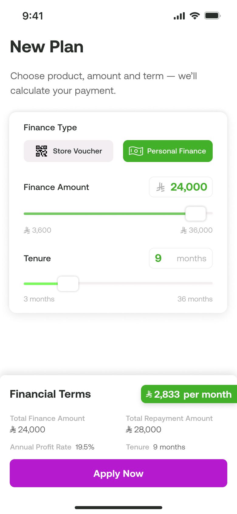
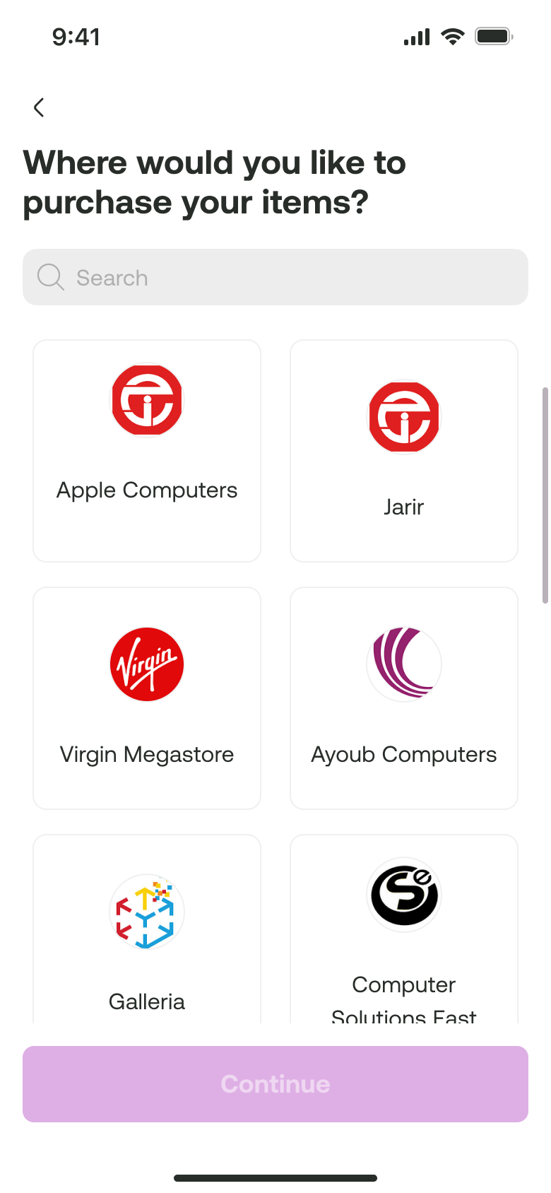
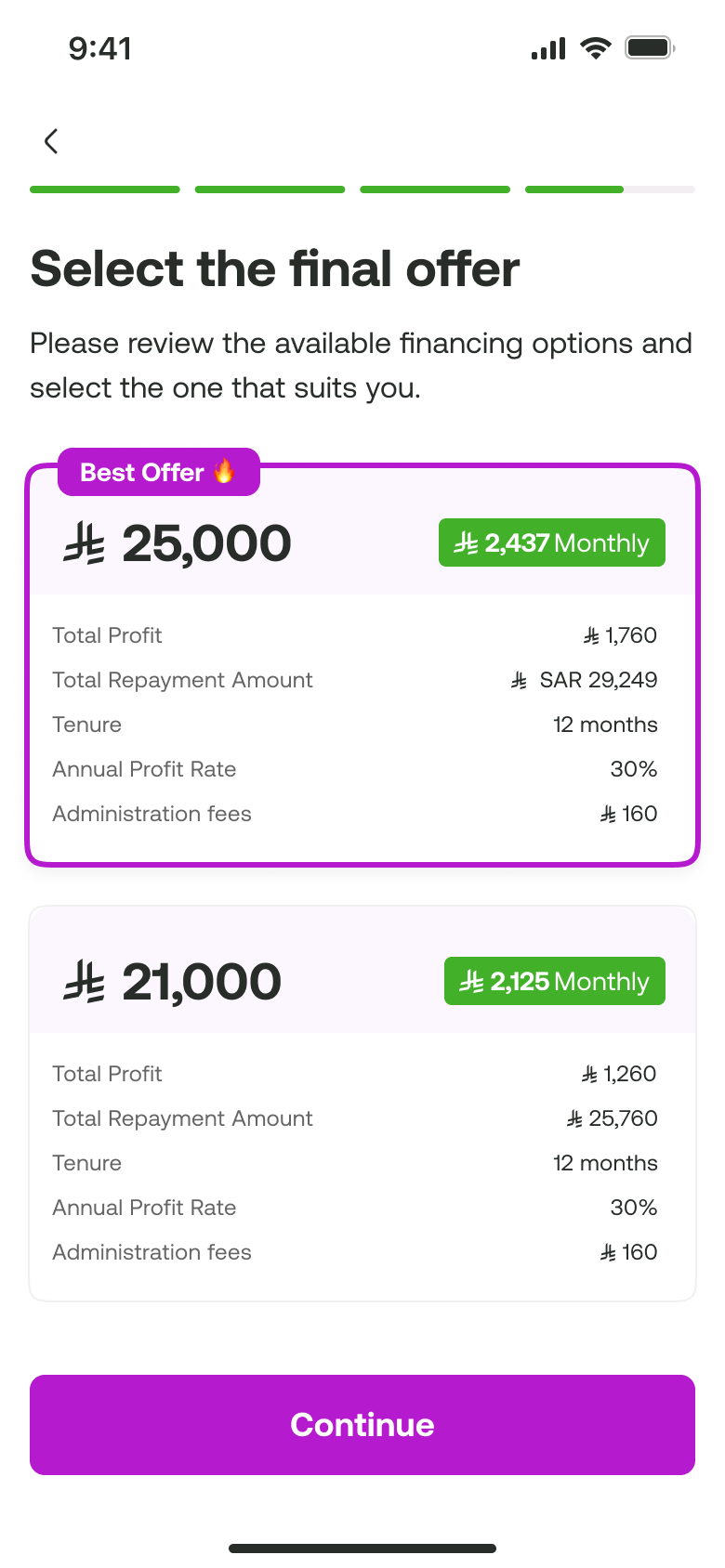
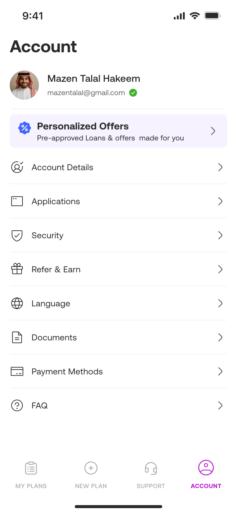
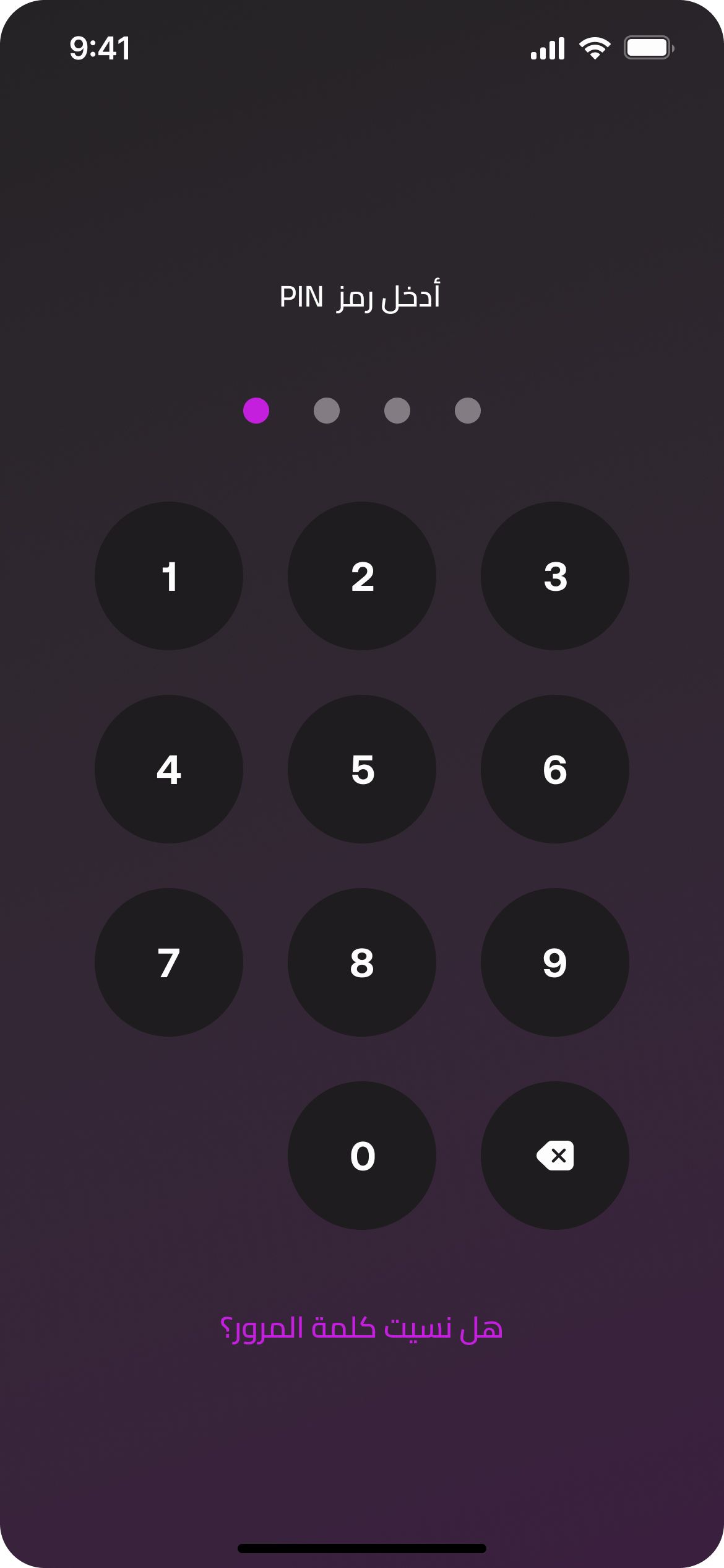
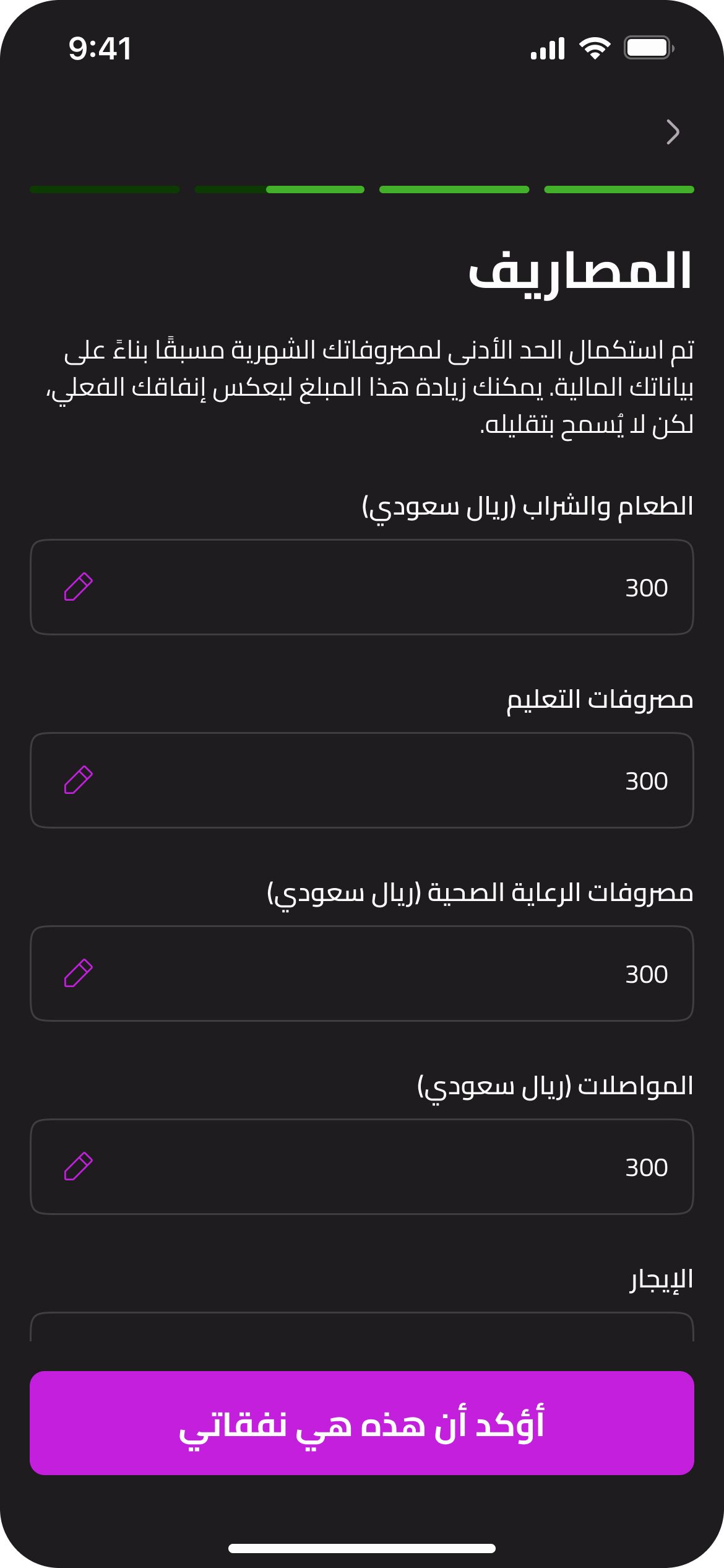
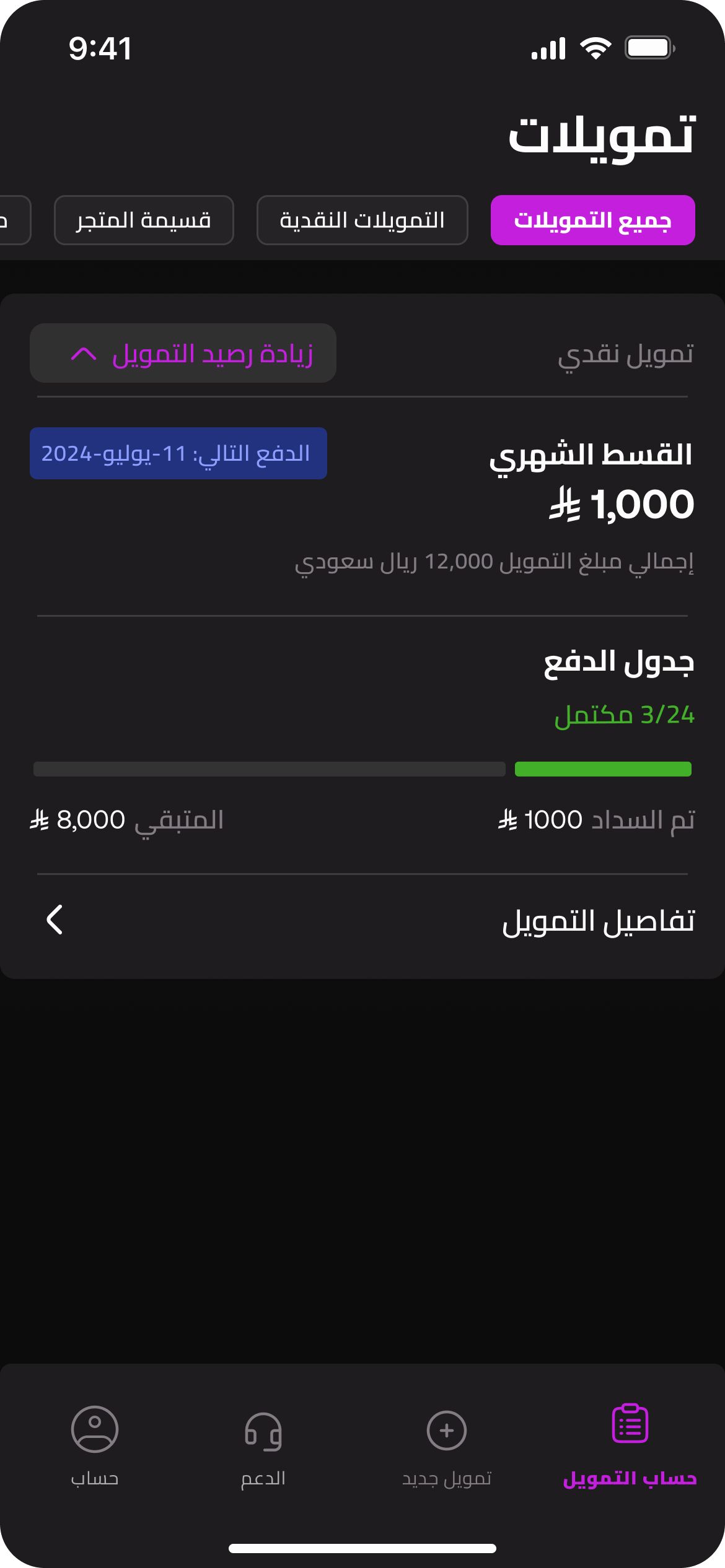
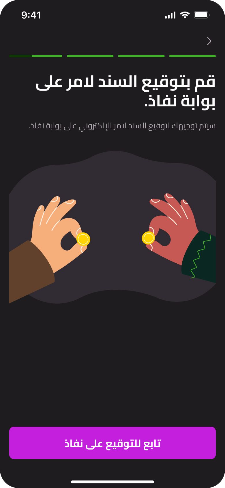
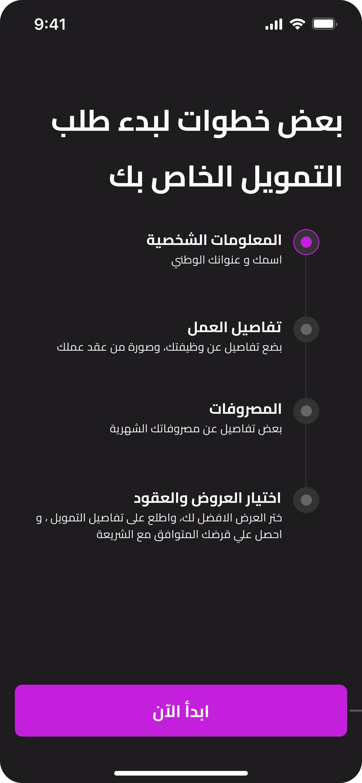
The product was shaped around several interconnected journeys, taking users from discovering a financing option through application, verification and approval, to managing their financing and repayments. Personal financing From exploring available financing options through eligibility, application and approval. Store vouchers A separate journey allowing users to discover and purchase vouchers through the platform, with repayment structured in installments. Verification & eligibility Key steps throughout the application journey, including identity and financial checks required for the Saudi market. Repayments A dedicated experience for understanding upcoming payments, tracking financing and managing repayments. Each journey was designed as part of the wider product system, with shared patterns and components carried consistently across mobile and web.
Application journeys
Start
- onboarding tutorial
- preliminary calculator
Personal finance
- personal finance
Store voucher
- store voucher
- store selection
- item type
Both journeys
- account creation
- identity
- financial info
- employment info
- preliminary offer
- final offer
- contract signing
Personal finance
- bank details
- verification call
- transfer
Store voucher
- payment code
App map
- Log in
- home [my plans]
- financing details
- settlement
- cancellation
- reschedule
- Top up
- account
- Offers
- offer page
- account details
- applications
- security
- language
- payment methods
- Appearance
- Offers
- new plan
- preliminary offer
- offer
- bank details
- contracts
- transfer
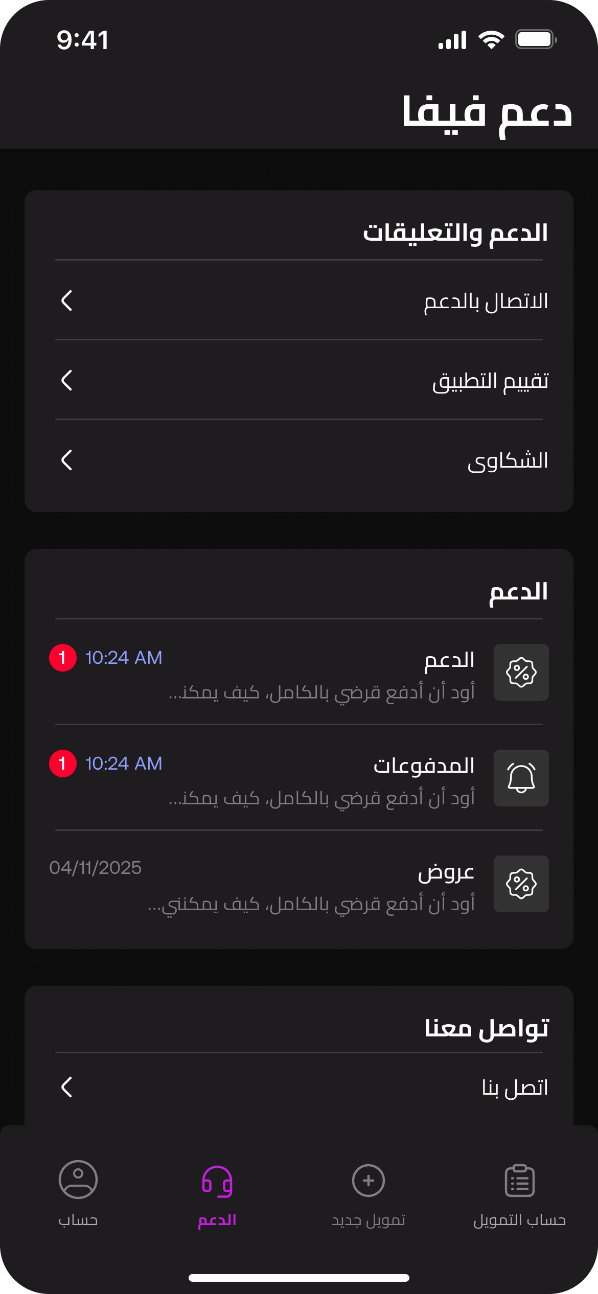
- support
- complaints
- rate the app
- Chats
- faq
- contact info
- financing details
- home [my plans]
05 — Design system: a lean foundation
For a product being built from the ground up, I kept the design system intentionally lean. A focused set of colors, typography, spacing and core primitives was enough to support the entire product without creating unnecessary complexity. The system was designed to be easy to navigate and maintain as a solo designer, while remaining flexible enough to evolve with the product. I started with a deliberately small set of foundations — color, type, spacing and core primitives — translating the existing brand into a usable product language. I focused on the components and patterns the product actually needed, keeping the library easy to navigate and quick to extend. The same foundation carried across mobile and web, light and dark, and LTR and RTL, giving the product consistency without adding unnecessary complexity.
- Brand Green 100%
# 43B02A - Brand Primary
# C31FDD - Background Surface 1
# 1E1C1E - Background Surface 1 – Elevated
# 262326 - Background Surface 2
# 0C0C0C - Background Surface 3
# 333333 - Background Input field
# 2F2E2F
- Brand Green 100%
# 43B02A - Brand Primary
# B51ACE - Background Surface 1
# FFFFFF - Background Surface 1 – Elevated
# FFFFFF - Background Surface 2
# FCF7FE - Background Surface 3
# F3EEF2 - Background Surface 4 – Elevation Dark
# F3EEF2