Case Study: Launching the ZOOD Virtual Installments Card
- Type of work
- UX DESIGN
- Client
- ZOOD
- Date
- 2022–PRESENT
- Credit
- SERGEY YERMILOV (PRODUCT), ZOOD DEV TEAM, LAMIA GERIOS (PAYMENT TEAM),
as a product designer at Orient Swiss, I have contributed to enhancing digital products over the years. Headquartered in Switzerland, ZOOD operates across fast-growing FinTech emerging markets, serving over 10 million users. The company offers a comprehensive ecosystem that integrates FinTech, E-commerce, and E-logistics, with lending at the core of its operations. Included are case studies that showcase how various UI/UX challenges were addressed to drive measurable improvements—such as increased conversion rates, the launch of new products and services, and enhanced user interface and experience.
INVOLVMENT
As the product designer behind the launch of the ZOOD Virtual Installments Card, I was responsible for defining and delivering the entire user experience—across card issuance, activation, and management flows—tailored to two very different markets. My work spanned from mapping cross-market user journeys and collaborating with developers to localizing flows for regulatory and behavioral differences between Pakistan and Uzbekistan.
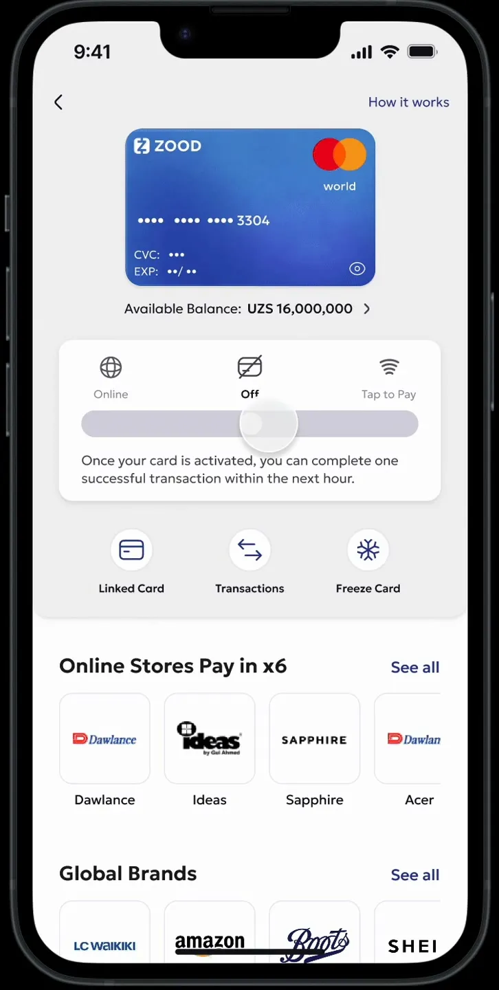
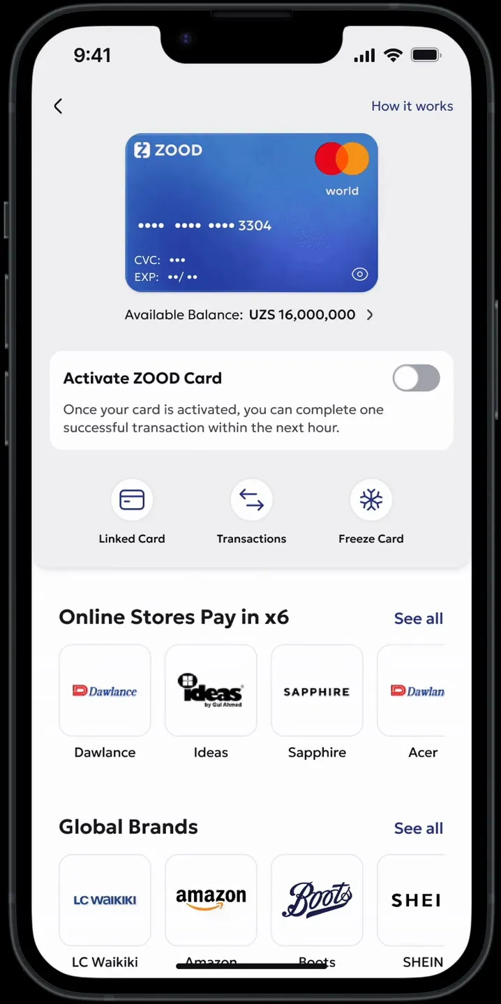
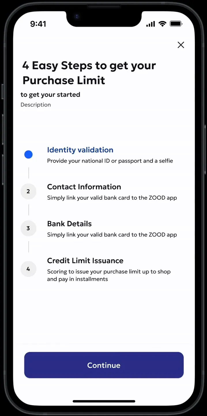
- Designed the card issuance flow, integrating EKYC, credit limits, and compliance across markets. Developed and tested two activation UX patterns (inline toggle & full-screen modal) to support both online and tap-to-pay transactions. Reframed a regulatory friction—manual activation before each use—into a security feature that built user trust. Built a unified card dashboard for linking repayment cards, freezing the card, and viewing balance and transactions.
- Designed educational content
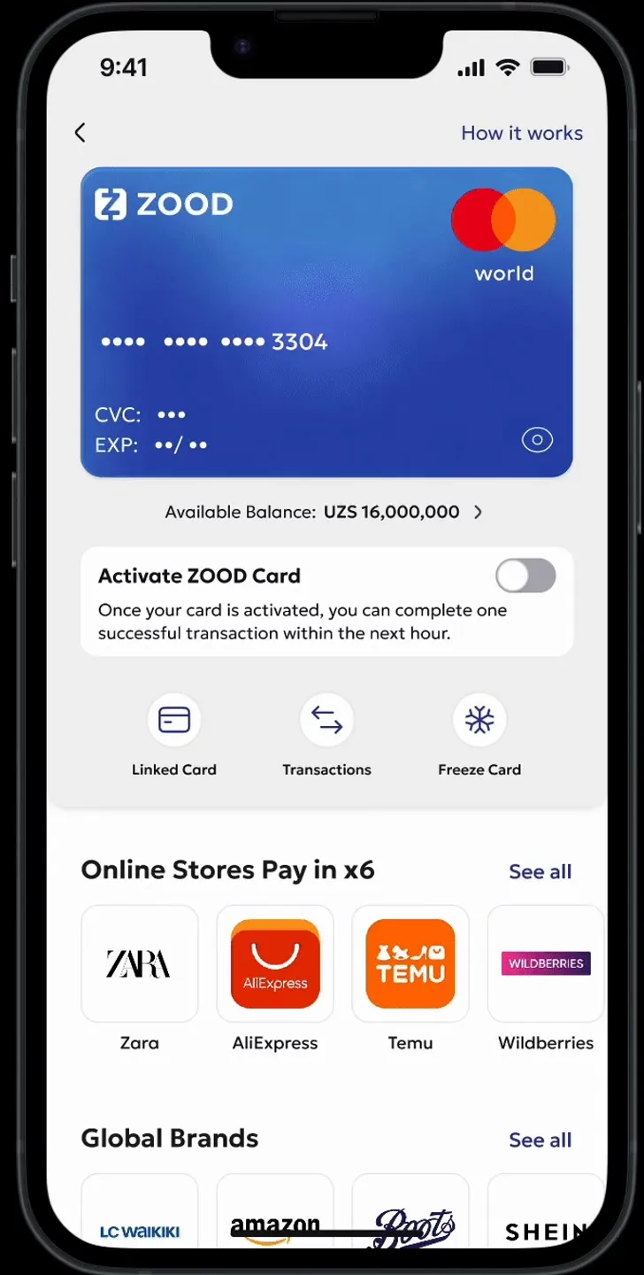
- Built a unified card dashboard for linking repayment cards, freezing the card, and viewing balance and transactions.
- Designed the store details pages
- Developed and tested two activation UX patterns (inline toggle & full-screen modal) to support both online and tap-to-pay transactions. Reframed a regulatory friction—manual activation before each use—into a security feature that built user trust.
CARD ISSUANCE
CARD ACTIVATION
The card had to be activated manually before each transaction. This friction, while necessary due to technical and regulatory constraints, posed a significant usability risk. Our goal: how might we turn this mandatory step into a moment of user trust and control—rather than frustration?
INTRODUCTION OF CONTACTLESS PAYMENTS
Multiple variations of the tap to pay activation were tested. Winner? The simplest. While we were in awe of our two way toggle, after testing on a user group, it seemed that for our market the bottom sheet approach was the clearest.